Kelvi · Case study 2 of 3
Keeping a product on its design system when most of the building is done by AI, and being honest about where that stops.
My Role
Founding Product Designer
Team
Gayatri
Design Head
Responsibilities
Design system architecture, workflow design, rules and enforcement, scoring the AI output
Built with
Claude Code, Cursor, Codex
Project Timeline
1 month
Aug - Sept 2026
Context
AI means a designer can now build and ship what they design. That moves the hard part.
Kelvi is an early-stage edtech product, built by two of us. One of us owns the design and the product. The other owns the teaching, how Kelvi responds when a child works through a problem. Most of the actual building is done by AI tools that neither of us is watching line by line.
This is the middle of three, between building the design system and the finished screens. It is about how the system stays followed once the building speeds up, and where it stops being able to help.
The Problem
The colour system had been thought through properly, with a reason behind every name in it. Inside three months it had two answers for the same colour.
The first name

The second name, written Tailwind's way
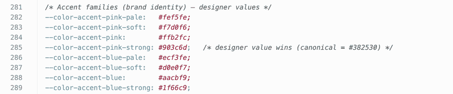
Two places in one file. One pink, two different shades, and a comment saying which one wins.
Every colour lived in one place, under one name. To put a colour on a screen you need a shortcut for it, and Tailwind only builds shortcuts for names written its own way. So every colour also got a second name, written the tool's way. Usually that second name points straight back at the first, so there is still one colour. In one place the colour had been typed out again instead, so when we changed the pink, only one of the two moved. This is an ordinary edit: you change a colour where you see it, with nothing to tell you a copy sits somewhere else. A comment said which one to use, but a comment does not do anything. Screens got whichever name they asked for.
Now nobody writes the second name. Each colour is written once, in one list, and a tool writes both names from it. There is no copy left to get wrong.
What was built
We moved the rules out of documents and into the step every change passes through: which colours, spacing sizes and components we have, and when not to use each one. So a dialog does not get rebuilt next to the one we already have. A change that uses a colour or size we do not have is stopped before it goes in.
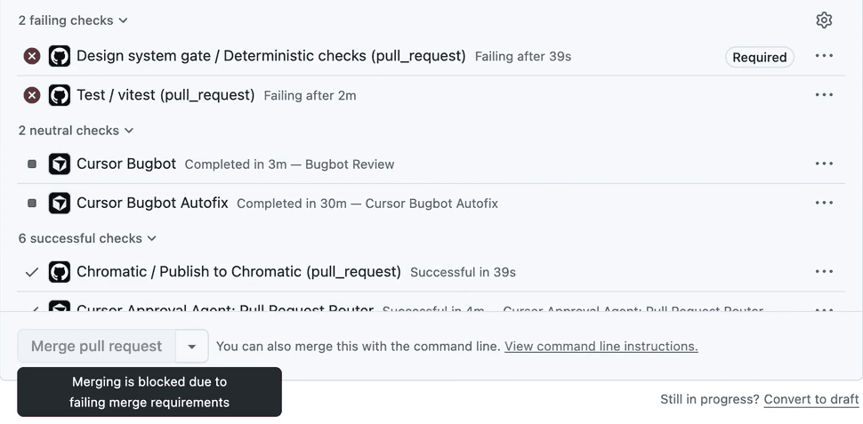
A change with a bad colour, stopped. The check failed in 39 seconds, and the change could not go in.
When we first built the check, it looked finished. To test it, we sent in a bad colour on purpose. The check caught it in thirty-nine seconds, but the change could still go in. One setting had the wrong name, so the check could say no but could not stop anything. We fixed the name, and now the same colour cannot go in.
Now every new check gets that test before we call it done.
Day to day, the change is quieter. My teammate has the rules without asking for them. Nobody argues about a colour again. A new screen starts from parts we already have, so we talk about whether it is the right screen, not whether the padding is ours.
175
The Limit
Green checks told us the work was on the system. They did not tell us the work was right. So we gave an AI tool twenty ordinary requests, the kind either of us would type on a normal day, one at a time, and marked every answer.

A later run of five requests, each marked on four things. Sixteen of the twenty marks are yes. All four of the misses sit in the one column no rule can check.
On the first run it invented nothing. It used our colours and our spacing. It passed every check on the first try. The rules can check those three. The fourth, whether it reached for the part we already had, is the one nothing can check, and it is the one it got wrong, five times out of seventeen. The later run, in the picture above, missed the same way. It made its own progress bar next to the one we already had. It fixed an old copy of a screen while the real one stayed wrong.
What it is not
This part needs saying plainly, because it is easy to read a piece like this and think the machine is doing the design.
It is not. The workflow stops us rebuilding what we already have and points at the right part. It says things like: use the dialog we already have, or this state already exists on another screen.

A sign-up step built through the workflow. Every part on it is ours, the spacing is on the scale, the focus ring is the one we decided on. It is also completely plain.
Spacing that is on the scale is not rhythm. Components that are all ours are not hierarchy. Deciding what a screen is for, what a child or a teacher should feel when it opens, and which one thing on it matters most, is not in any rule and never will be. The system exists so that the time goes there instead of into whether someone typed the right green.